LEARNING OUTCOME 1

INTERACTIVE MEDIA PRODUCTS

PAPER GAME PROTOTYPE

Goal

On our first week of semester two, we had to come up with a user-friendly game concept and make a paper prototype for it. The game had to be for two or more people, where people can interact and work together or against each other.

Process

Inspiration:

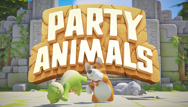
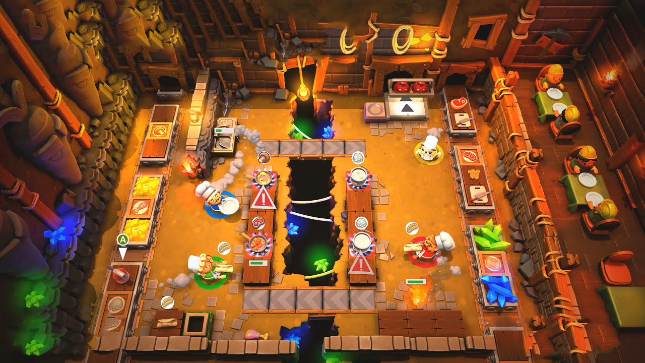
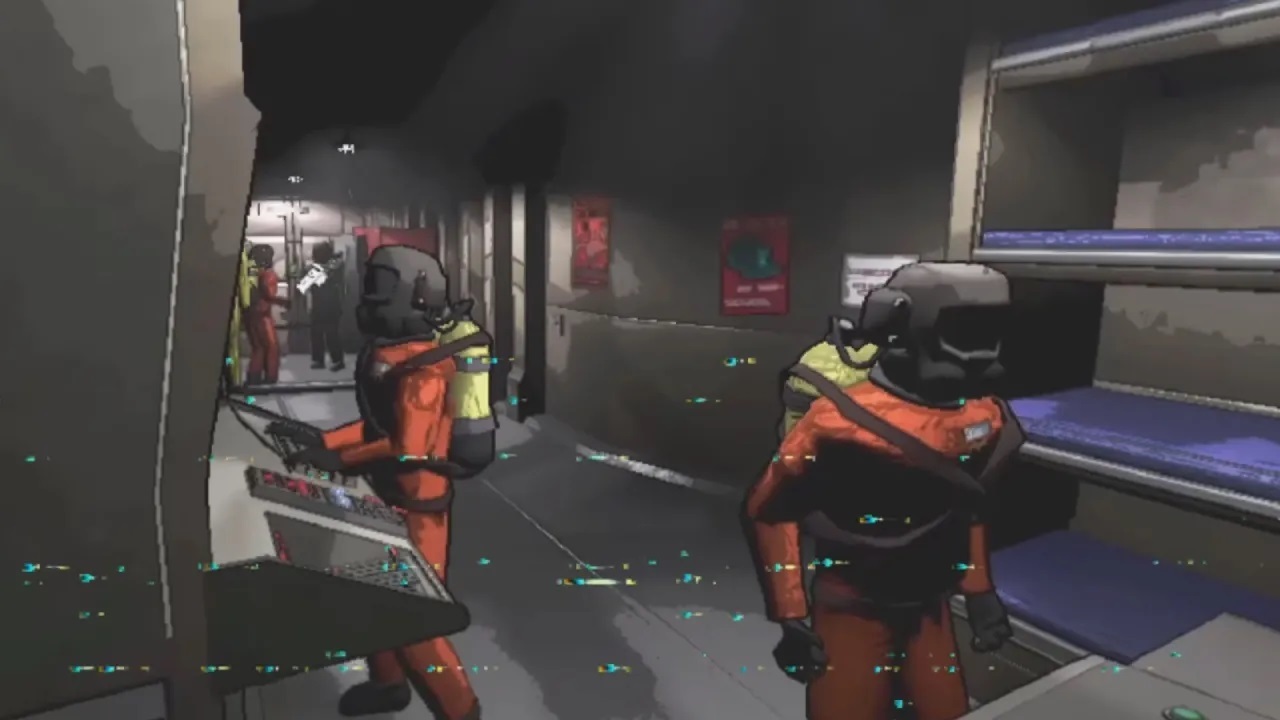
We started off by looking at some other games as inspiration. I was looking at games that first popped up in my mind when I heard the word cooperative. Such games like overcooked, plate up, lethal company, party animals, and few prop hunt games.

Concept Refinement:

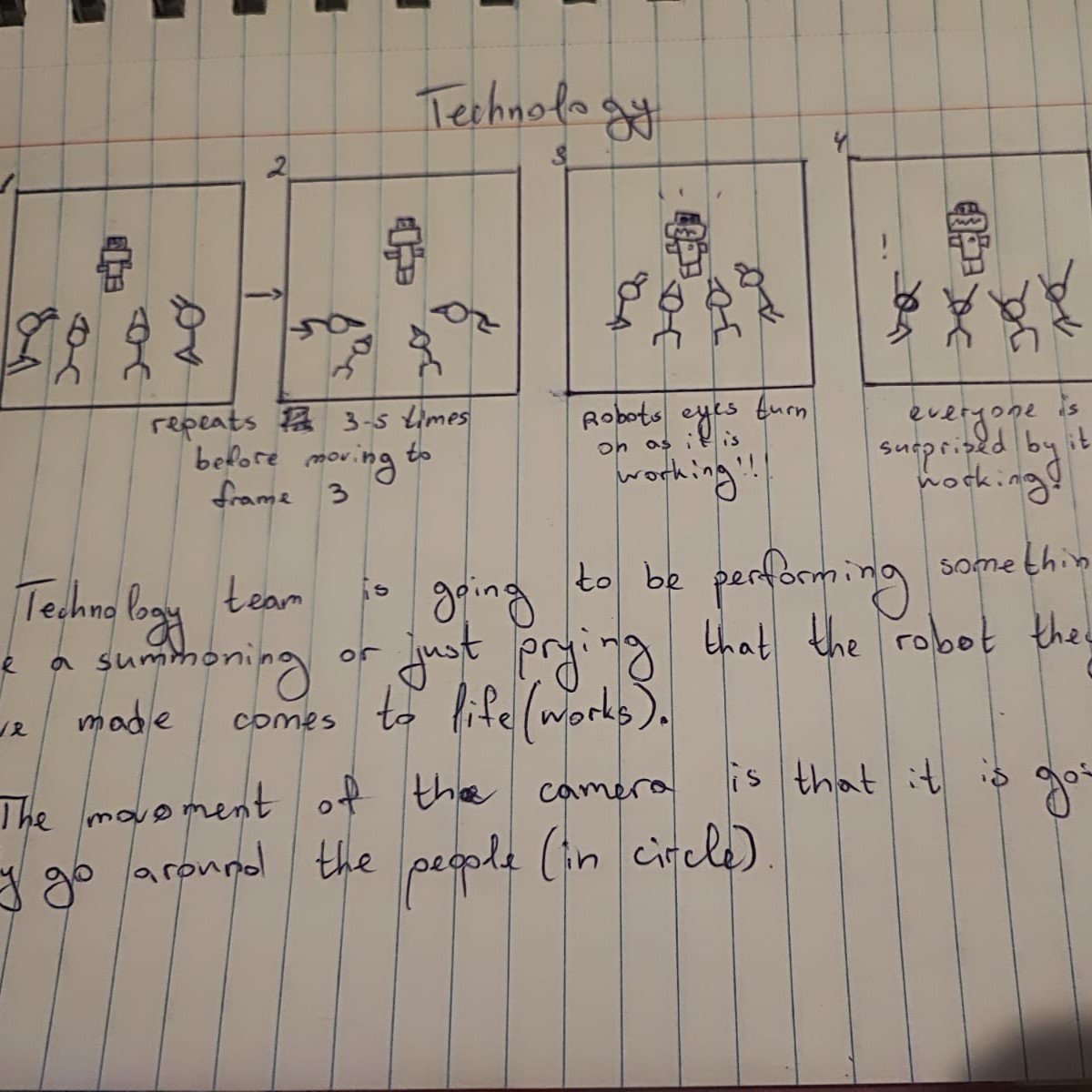
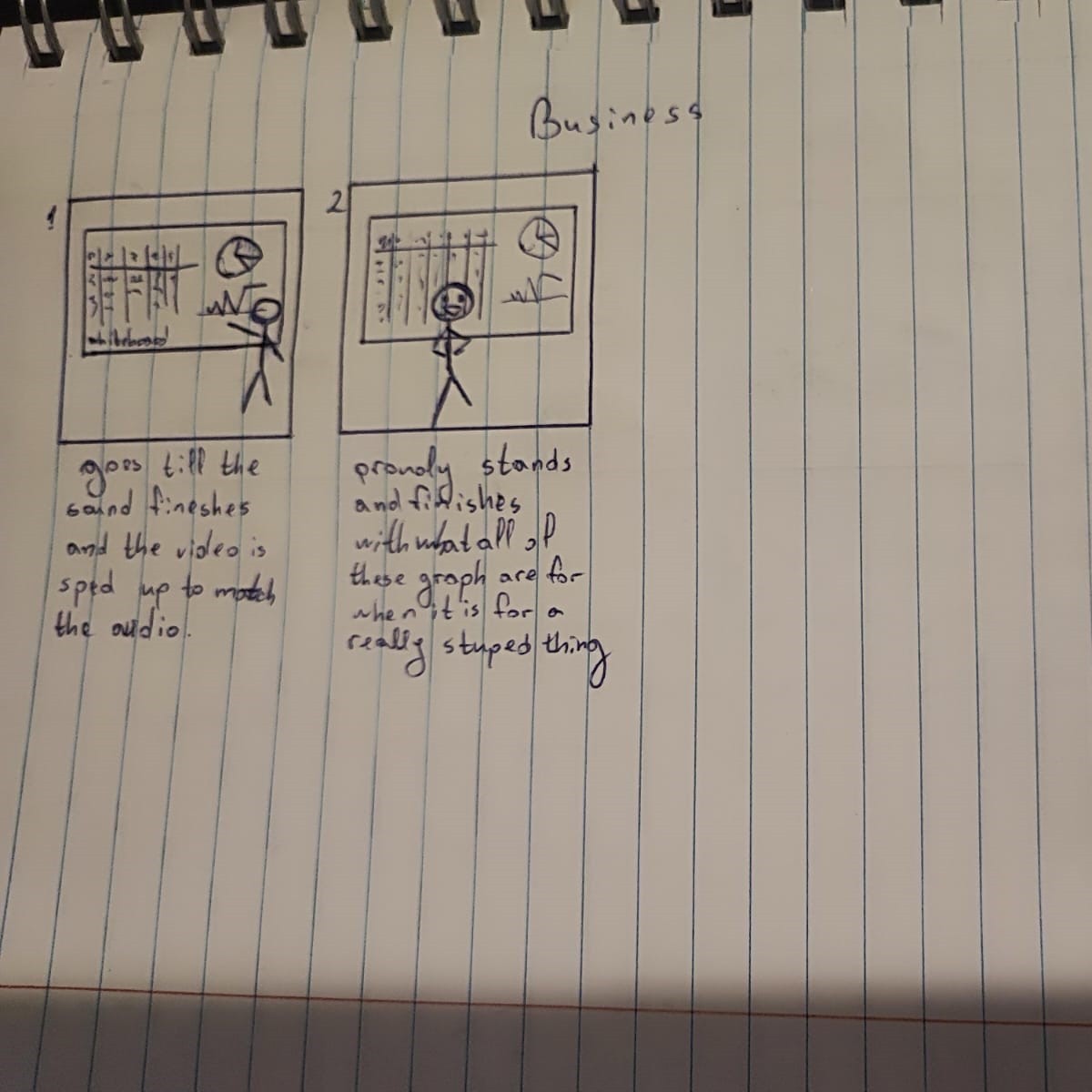
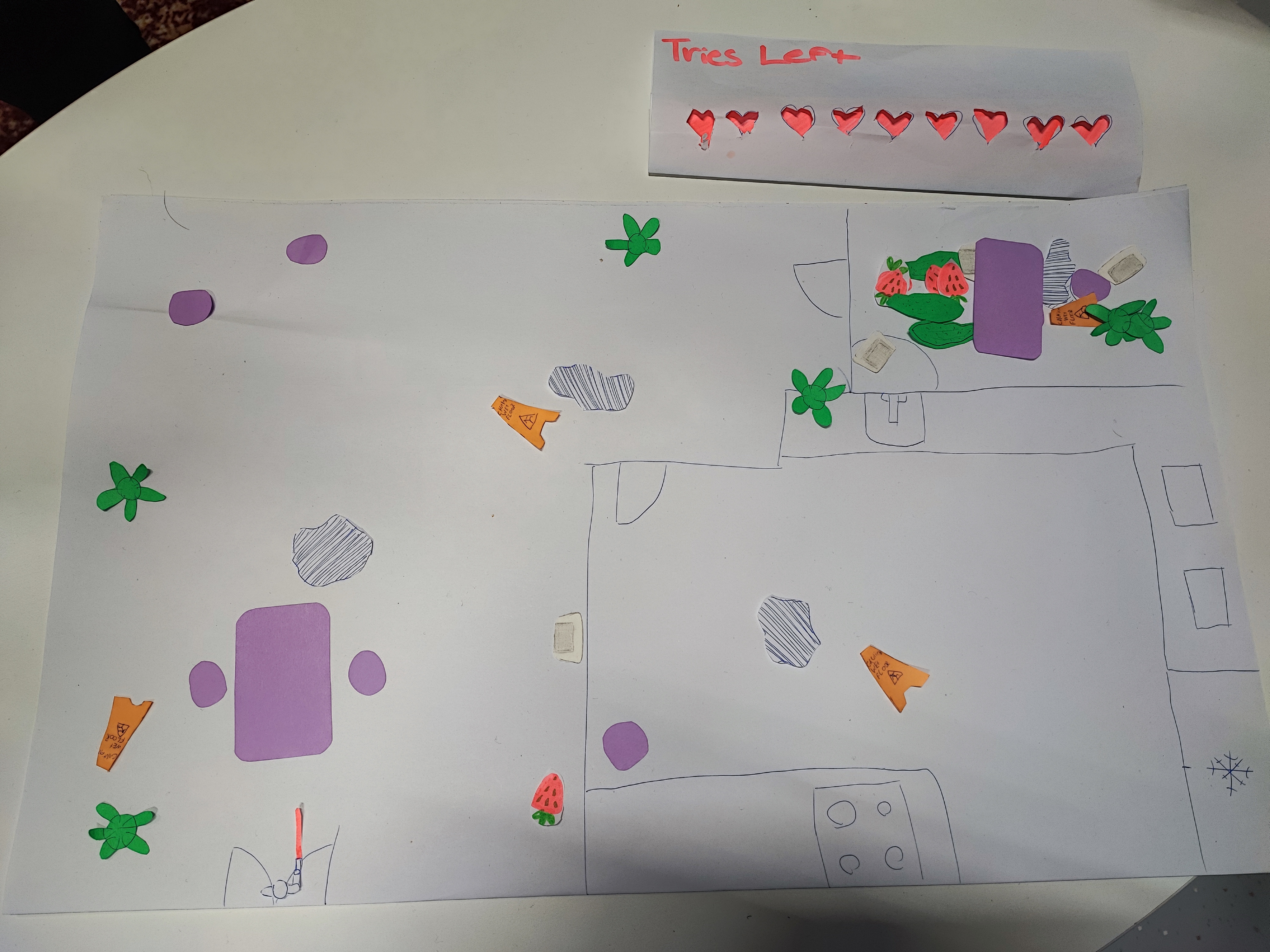
After everyone had few games in mind we tried to see if any of them we can interpret in our own way and concept. Many of the ideas were dropped out. We almost were left out of ideas and I just started explaining a bit more of the ideas I had in mind when I was typing my inspirations. I had envisioned a prop hunt game but from a top-down perspective. It is not very typical for such game genre to be from such view but that’s what I was hoping that would make the game a bit more unique. After explaining my idea, my team could finally visualise a bit better of the concept. We didn’t have much time left so we immediately started sketching out the rooms and props while coming up with some rules.

Rules Refinement:

We had to think of a way to make it so it is not very one-sided type of situation where it would be impossible to win as a hunter, or the opposite, win as a prop.

Result

We had a wide white paper that has the general map drawn on it, we had many different small paper pieces serving as props such as some chairs, tables, plants, puddles and so on. Along with that we finalised our rules in the game in a way is balanced. We decided that the total number of players that could play the game is going to be 6-8 (hunter included). We also decided on the hunter having 9 lives/trials before them losing the game. Each time he picks a wrong prop, a life is being taken out. To make the hunter a bit of more funny role we made a small model with a pistol where he can go roam around the room and point at the object he wants to shoot. In the end we put it on a table for professors and students to try it out, and was pleasant to see people playing the game.

Reflection

How did it go:

The whole process as a whole was okay, it was a bit stressful when we were stuck in a place and nobody was happy with the ideas we were coming with, but once we committed to one I was very happy with the outcome of it.

What did I learn:

It was the first time taking a bit of a lead and turns out is not as scary as I thought it might be. I still prefer to not be the leader but at least now I know that if I have to I can.

What I would do differently next time:

Will try explain my ideas a bit better from the very beginning and already try to visualize very quickly my ideas and hope so do the others so everyone has a better understanding of each others’ concepts.

GMC PROTOTYPE WEBSITE

Goal

I have as a goal to test our if the new webstie prototype and brand indentity we made for our client, GMC, and find if it is easier to navigate through, if the colours are nice, and if information is easy to understand, all compare to GMC's current (at that time) website.

Process

Preparing the Website:

Once I was done with the whole visual part of the prototype, I had to connect all the pages so people can scroll and go through all of the pages freely and not serve them a slide show of webpages.

Preparing Questions:

Me and another class-mate went on doing some user-tests outside of university to test the website prototype. I prepared few questions like:

- Do you think our website prototype is easier to navigate to compare to GMC's current website, if not what can we do to make your journey in the website easier?

- Were you able to find the information you were looking for more quickly on the new website? Why or why not?

- Were there any sections or pages that were difficult to find or access? If so, which ones?

- Do you like the new brand identity (colors, logo, typography) of the new website? If no, why not?

- How would you rate the aesthetics of the new website compared to the old one?

- Are there any new features on the website that you particularly liked or disliked? Which ones and why?

Result

Got very positive feedback on the new version of the GMC's website. People find it easy to navigate through the website prototype. One thing most people really liked is the remake of the "Upcoming Events" compare to the old one. Aesthetically wise, they like how there were more colours and the contrast between the blue and light-creamed colors.

PROTOTYPE

Reflection

How did it go:

It went pretty fast and easy, also probably one of the easiest user-tests I have done so far

What did I learn:

As long it is good to have the clients opinion on it, it is definitely a good thing to do a user test and see if the target audience also likes it and finds it better compare to the GMC's current (at that time) website.

What I would do differently next time:

Next time I will try and ask if I can record the interviewee to have some more proof and also if I forget anything I can go back and look it up if I missed some information

USER TEST GMC LOGO DESIGN

Goal

Show the logos I've made to a couple of people and seeing which one they prefer design-wise, when having in mind that we have a Wind Orchestra as a client and if they are able to read and recognise the GMC in it. Along with that, I had to check which logo they connect with cars.

Process

I just picked my laptop with the 5 Designs I had prepared and went around the tables asking the few prepared questions as to “which one do you like the most design wise”, “which one do you think fits a Wind Orchestra the most” and “which one reminds you of car related stuff”.

Result

Having a clear understanding of which logo people like, connect with orchestra and connect with car parts brand. Along with that I had some info and proof as to the logo, chosen by our client, is actually the one people connect the most with cars, which was one of the fears of our client.

Reflection

How did it go:

It was pretty stressful, seeing the fact that the logo that the client picked is the least like amongst the people I went around and asked (approx. 10 people). Was nervous and debating if I should tell my client that what they are choosing at the moment, might not be the best way to go

What did I learn:

That making client happy and also the target audience is very hard and there should be a lot of communication to both faces and see how is it going. Along with that I learned how I should present my logos better.

What I would do differently next time:

When presenting the logos to the clients and it is more on the abstract side, I would highlight different parts of it showing what it represents, making it easier for the client to see our direction.

FONTYS MEDIA CAPMAIGN STORYBOARDS

Goal

To get peoples approval if we can do videos of making fun of each profile in the university. Along with that to see if they like some of the already made storyboard ideas and if they find them funny.

Process

People’s approval:

Once I was done with the storyboards, me and another classmate started going around the university and finding people from different profiles (approx. 4 people of each profile). We had just few straight up questions as if they are okay with making funny videos about each profile with exaggerating some of the stereotypes as well as some relatable moments in uni.

Storyboards:

Started showing my storyboards, to the students we asked for approval at first, and explain what is our idea behind each video we have in mind so far. We wanted to see if they find the ideas funny, and if not, how we can make them so.

Result

Got people’s approval as to this concept does not offend them. Along with that, found out that people like the ideas we have so far, therefore we could proceed further in our project into starting making those videos. With all of that information, I also wrote a research on this topic to serve as a proof of concept.

RESEARCH

Reflection

How did it go:

It went pretty smoothly, was so curious to see if the humour we planned, translates easily and people understood it without getting offended.

What did I learn:

It is important to get peoples approval and check if something is wrong how can you change it so it doesn’t offend anybody but still keep the main idea in there.

What I would do differently next time:

Probably prepare some more storyboards for people to have some more variety and give better idea of what we are going for.

MINI RPG PIXEL GAME

Goal

To make a cozy mini pixalart top-down game where you can walk around.

Process

People’s approval:

Once I had the game done I send the links to few people to see if they find it easy to move around and if they do think I have captured that coziness. On top of that I managed to get some feedback on a small bug, which I immediately fixed! The small bug was that the collusion with the table and mini couches.

Result

People were finding the game adorable and really impressive as it was my first time, despite that small bug there wasn't anything else they saw wrong. (more information on how it was made you can find on LO2 and LO3)

PIXEL RPG